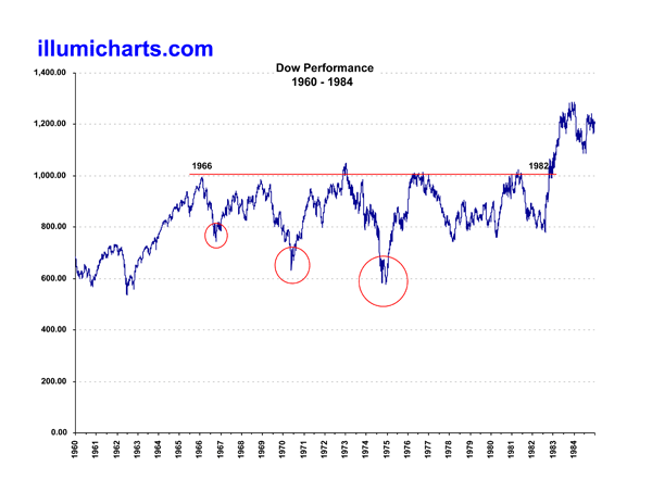
Dow Performance 1960-1984
This chart is simply the Dow Jones Industrial Average from 1960 to 1984. These dates were chosen to show that during those years there was no real growth apparent in the performance of the Dow. That's over 20 years of no growth! Also, during this time there were actually three Dow crashes, an approximately 20% crash in 1966, a 30% crash in 1970, and a 40% crash in 1973. Which of these would be a better comparison for the more recent crash of 2008/2009? I don't know. See the comparisons How Low Dow, How Low Dow 70, How Low Dow 66, and How Low Dow 68 to judge for yourself.
Data for the Dow can be found at Yahoo! Finance.

