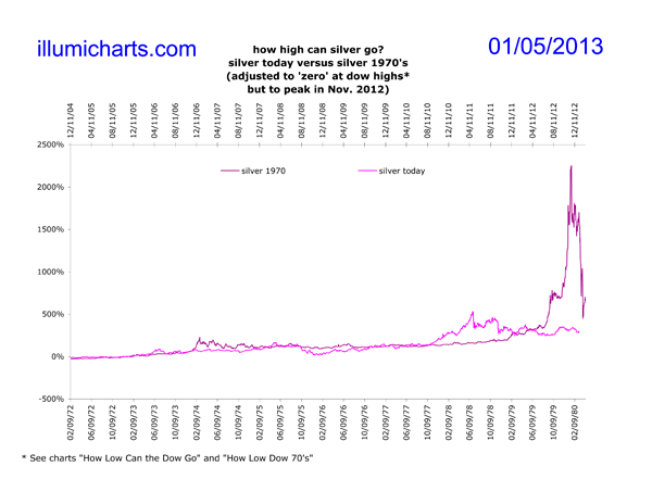
How High Silver 2012
This chart is no longer updated.
Many people believe that the year 2012 has special significance for the PTB. Also, given how similar the gold curves appear on the Dow/Gold Ratio, today's cycle is probably better compared to the 1921-1933 one than it is to the 70's. Together with the fact that 2012 is an election year, it becomes a likely candidate for the cycle end date.
A direct comparison of gold prices between the cycle in the 1920's and 30's cannot be made because the US was on a gold standard at the time. A comparison with silver, however, could be made, if I were able to find daily price data back that far. Unfortunately, the best I have been able to do for daily silver price data is back to 1967. Hence, this chart, like the How High Gold 2012 chart uses lines "zeroed" at the Dow highs (as they appear on the How Low Dow 1970's chart) but with the current silver line moved forward to peak at an arbitrary date of November 2012. Both of the silver lines are still "zeroed" at the Dow highs, but the "zeros" no longer line up date-wise on the chart.
UPDATE: 2012 has come and gone and civilization persists. Hence we are back to our estimated end-date for this cycle based on the Dow highs. See charts How High Silver and How High Gold for more details.
Data for the price of silver comes from the daily London Fix and is available on Kitco's website.

