How High Silver
This chart is updated every Saturday.
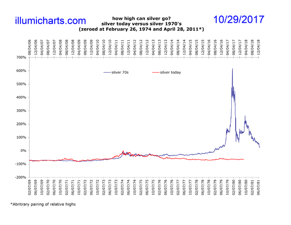
New! I've added another chart that uses an arbitrary comparison of the highs in silver from the 1970's cycle and the relative high from today. This is rather arbitrary, but given the similarity in the curves of the graphs, seems worthwhile. Also check out the new chart showing aprice performance comparison between the Dow and Gold.
This chart uses the dates of the Dow highs, from the How Low Dow 70s chart, January 1973 and October 2007, to create a "zero" point for a comparison of the silver price and a possible end date for the cycle. Because today's cycle is much more like the cycle that occurred in the 20's and 30's than it is to the one that occurred in the 60's and 70's, and because of other factors, like 2012 being an election year, it is quite likely that the end of the current cycle will be 2012 instead. See the charts How High Gold 2012 and How High Silver 2012 for more information.
Data for the price of silver comes from the daily London Fix and is available on Kitco's website.

